Hematorun
Hematorun
Hematorun
Hematorun
Hematorun
A clear and supportive registration platform for a charity run fighting blood cancer.
A clear and supportive registration platform for a charity run fighting blood cancer.
A clear and supportive registration platform for a charity run fighting blood cancer.
A clear and supportive registration platform for a charity run fighting blood cancer.
A clear and supportive registration platform for a charity run fighting blood cancer.
Summary
Summary
Project Overview
Project Overview
Hematobieg.org is a website created to support a charity run organized by the Foundation for Helping People with Leukemia. The platform enables volunteers and participants to register for the event, learn key details (location, schedule, route, attractions), and engage with the Foundation’s mission: helping individuals battling blood cancers. The website needed to be fast, intuitive, emotionally supportive, and accessible to users of all ages, including people with limited digital experience.
Hematobieg.org is a website created to support a charity run organized by the Foundation for Helping People with Leukemia. The platform enables volunteers and participants to register for the event, learn key details (location, schedule, route, attractions), and engage with the Foundation’s mission: helping individuals battling blood cancers. The website needed to be fast, intuitive, emotionally supportive, and accessible to users of all ages, including people with limited digital experience.
Target users
Target users
Runners, volunteers, donors, supporters of the foundation.
Runners, volunteers, donors, supporters of the foundation.
Problem Statement
Problem Statement
The Foundation lacked a clear and easy-to-navigate website dedicated to their charity run. Existing communication channels were fragmented, making it difficult for users to:
find event details quickly
understand where and how to sign up
complete registration without confusion
access legal information and event logistics
feel emotionally connected with the cause
The Foundation also needed visual coherence and modern communication materials for social media to promote the event effectively.
Platform
Platform
Responsive Website
Responsive Website
Services
Services
UX/UI Design
UX/UI Design
User Research
User Research
Usability studies
Usability studies
Prototyping
Prototyping
A/Bn Testing
A/Bn Testing
Goal
Goal
The goal was to design a simple, friendly website that would:
guide users smoothly through the registration process
clearly communicate practical details (date, location, rules, route, attractions)
increase event sign-ups
strengthen emotional connection with the Foundation’s mission
provide a reliable base for marketing and social media promotion
My role
My role
As part of a three-designer UX team, I was responsible for gathering requirements, mapping the user journey and registration flow, and creating wireframes and early mockups for the website. I designed the registration form and legal notes, refined the UI, prepared the UI Kit and documentation for developers, adapted the layouts for mobile, and created social media graphics supporting the event promotion. Throughout the project, I collaborated closely with the development team to ensure smooth implementation.
Additionally, I supported the Foundation’s communication by overseeing their social media presence and creating posts and graphics using tools such as Procreate, Canva, and Figma.
Impact
Impact
The final website delivered:
A clear and frictionless registration process
Improved understanding of event logistics and purpose
Increased accessibility with mobile-friendly layouts
Stronger emotional engagement around supporting patients
Consistent branding across website and social media
Smooth collaboration with developers thanks to detailed documentation
Live website: hematobieg.org
Design process
Design process
STEP I
STEP I
Discovery & Requirements Alignment
Discovery & Requirements Alignment
The project began with in-depth conversations with the Foundation’s team, during which we clarified the event’s purpose, gathered all essential information, and outlined the expectations for the website. We discussed visual direction, user needs, and the types of content required to effectively guide participants through the charity run registration process. Based on this, I mapped the initial User Journey and created a clear User Flow for sign-ups, ensuring the experience would feel simple and intuitive from the very first interaction.
The project began with in-depth conversations with the Foundation’s team, during which we clarified the event’s purpose, gathered all essential information, and outlined the expectations for the website. We discussed visual direction, user needs, and the types of content required to effectively guide participants through the charity run registration process. Based on this, I mapped the initial User Journey and created a clear User Flow for sign-ups, ensuring the experience would feel simple and intuitive from the very first interaction.
Key elements:
Stakeholder interviews & expectations alignment
Defining content scope and information architecture
Identifying must-have features and event logistics
Creating Site Map, User Journey Map and Registration User Flow
Establishing emotional tone and visual direction
Stakeholder interviews & expectations alignment
Defining content scope and information architecture
Identifying must-have features and event logistics
Creating Site Map, User Journey Map and Registration User Flow
Establishing emotional tone and visual direction
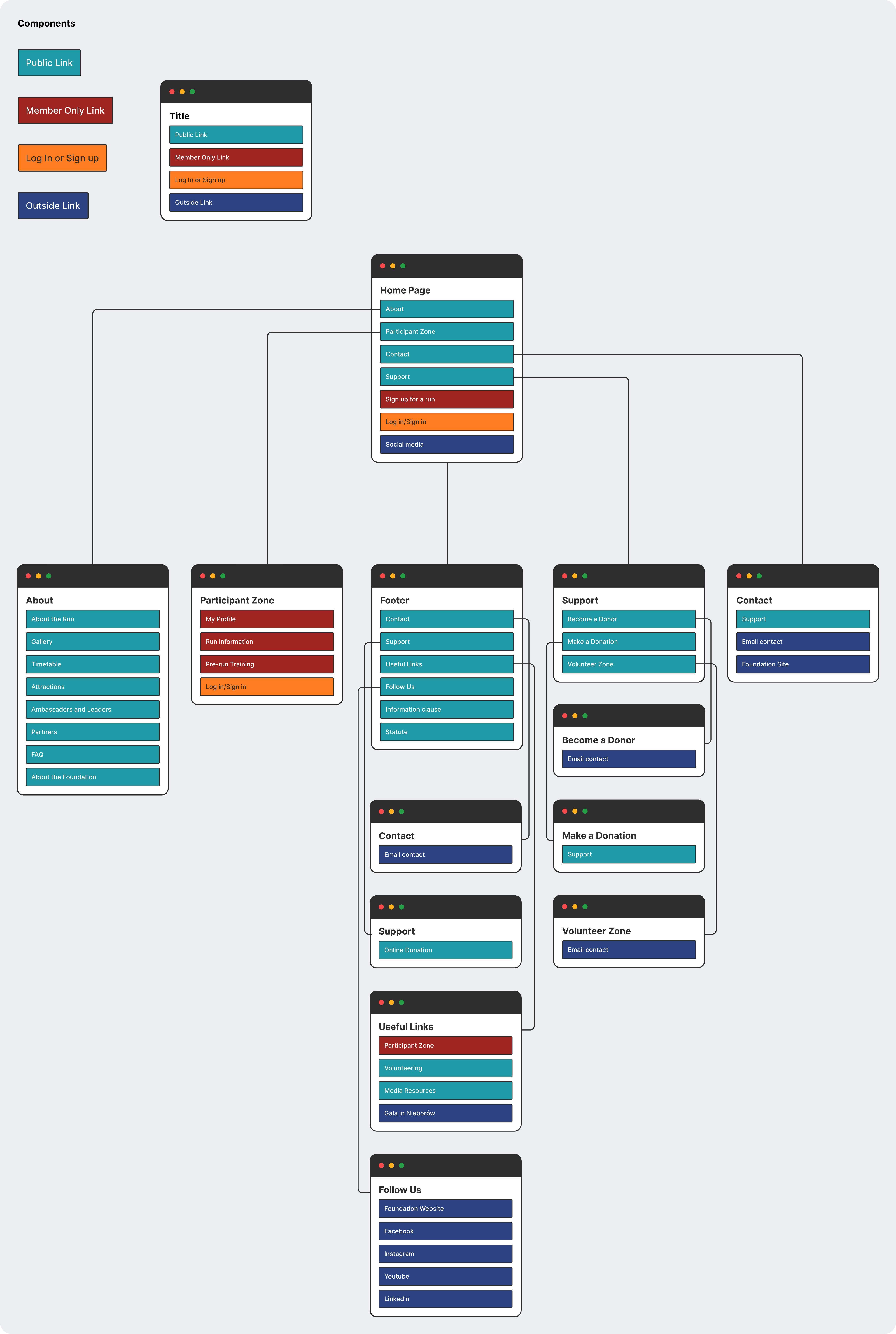
Initial Sitemap
Initial Sitemap
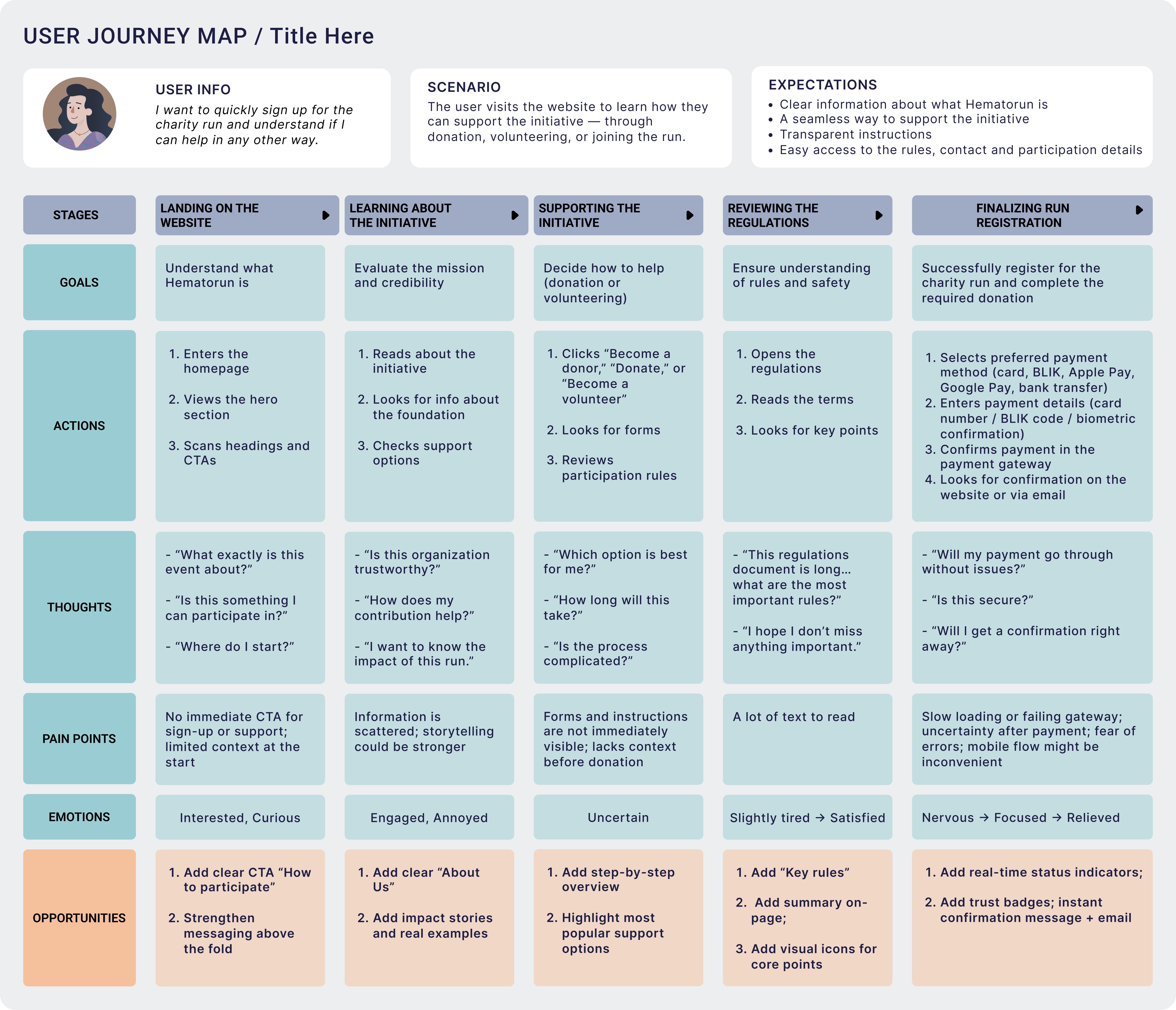
User Journey Map
User Journey Map
STEP II
STEP II
Information Architecture & Early Mockups
Information Architecture & Early Mockups
Once the structure was clear, I moved into wireframing to translate the agreed vision into tangible layouts. I focused on clarity, readability, and effortless navigation, especially for users who may not be experienced with digital forms. I designed the entire registration process, including necessary legal notes and consent sections, and created the first visual mockups to explore the hierarchy, layout rhythm, color palette and tone of communication across the site.
Once the structure was clear, I moved into wireframing to translate the agreed vision into tangible layouts. I focused on clarity, readability, and effortless navigation, especially for users who may not be experienced with digital forms. I designed the entire registration process, including necessary legal notes and consent sections, and created the first visual mockups to explore the hierarchy, layout rhythm, color palette and tone of communication across the site.
Key elements:
Low-fidelity wireframes for core pages
Planning the full registration form and legal notes
Structuring key informational sections
Early mockups exploring layout and hierarchy
Validating clarity with stakeholders
Low-fidelity wireframes for core pages
Planning the full registration form and legal notes
Structuring key informational sections
Early mockups exploring layout and hierarchy
Validating clarity with stakeholders
Early mockups, testing different color palettes
Early mockups, testing different color palettes
STEP III
STEP III
Visual Refinement, Functional Improvements & UI Documentation
Visual Refinement, Functional Improvements & UI Documentation
With the first mockups reviewed, I refined the interface to improve readability, structure, and visual balance. I strengthened the hierarchy, adjusted spacing, and clarified CTAs to guide users smoothly toward registration. At this stage, I also prepared the foundational UI Kit and documentation for developers, ensuring consistency and making the implementation process easier and faster.
With the first mockups reviewed, I refined the interface to improve readability, structure, and visual balance. I strengthened the hierarchy, adjusted spacing, and clarified CTAs to guide users smoothly toward registration. At this stage, I also prepared the foundational UI Kit and documentation for developers, ensuring consistency and making the implementation process easier and faster.
Key elements:
Improving visual hierarchy and readability
Refining form usability and CTA visibility
Ensuring accessible color contrast
Creating UI Kit and design documentation
Strengthening storytelling around the event’s mission
Improving visual hierarchy and readability
Refining form usability and CTA visibility
Ensuring accessible color contrast
Creating UI Kit and design documentation
Strengthening storytelling around the event’s mission
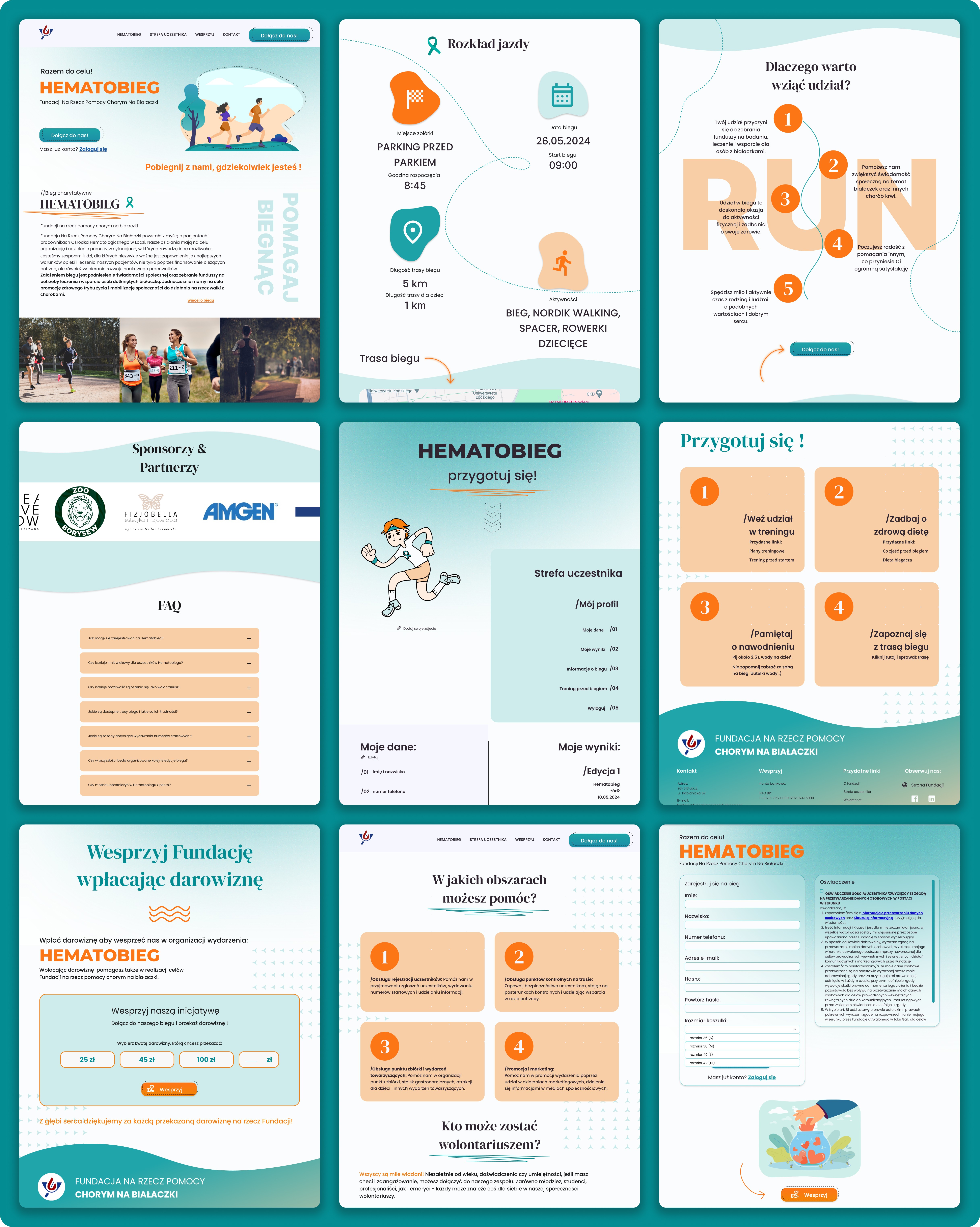
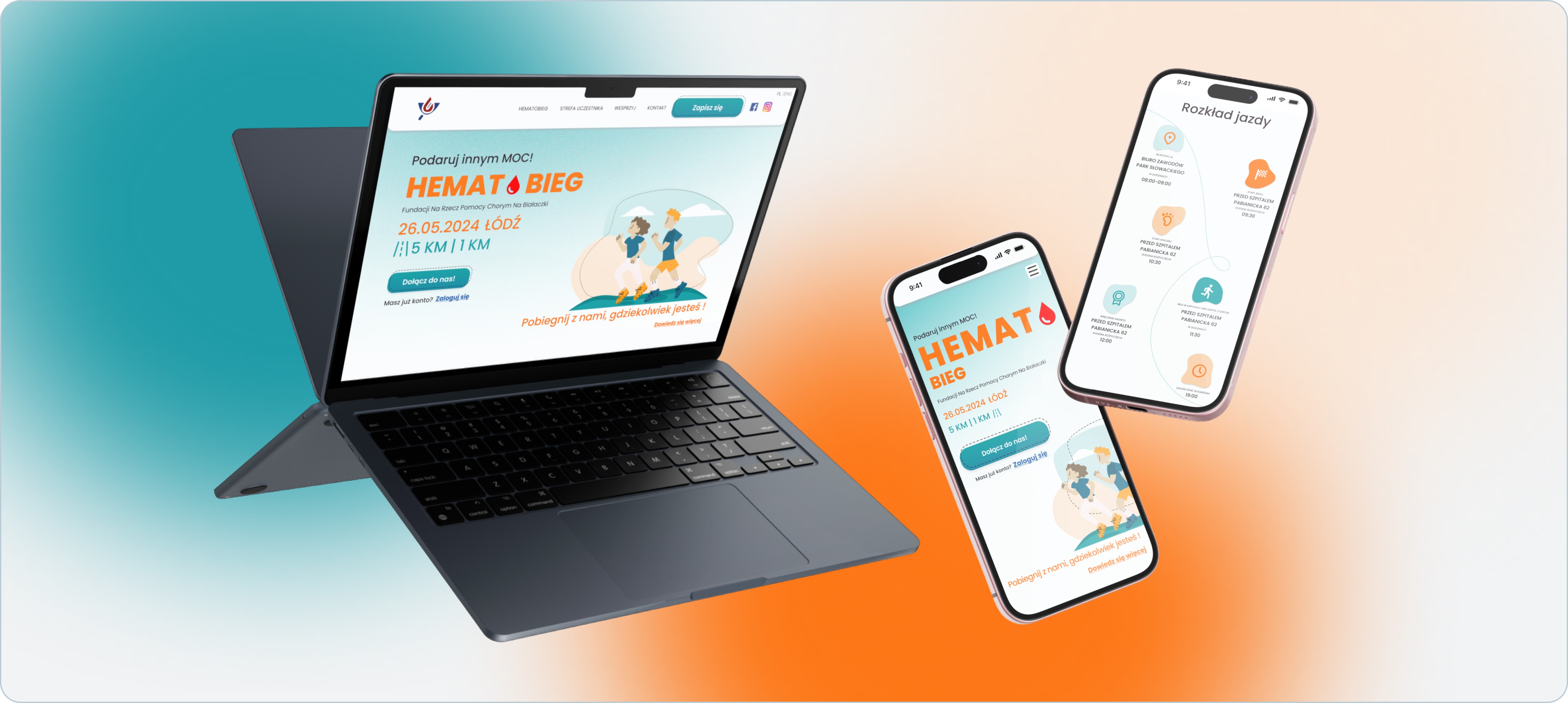
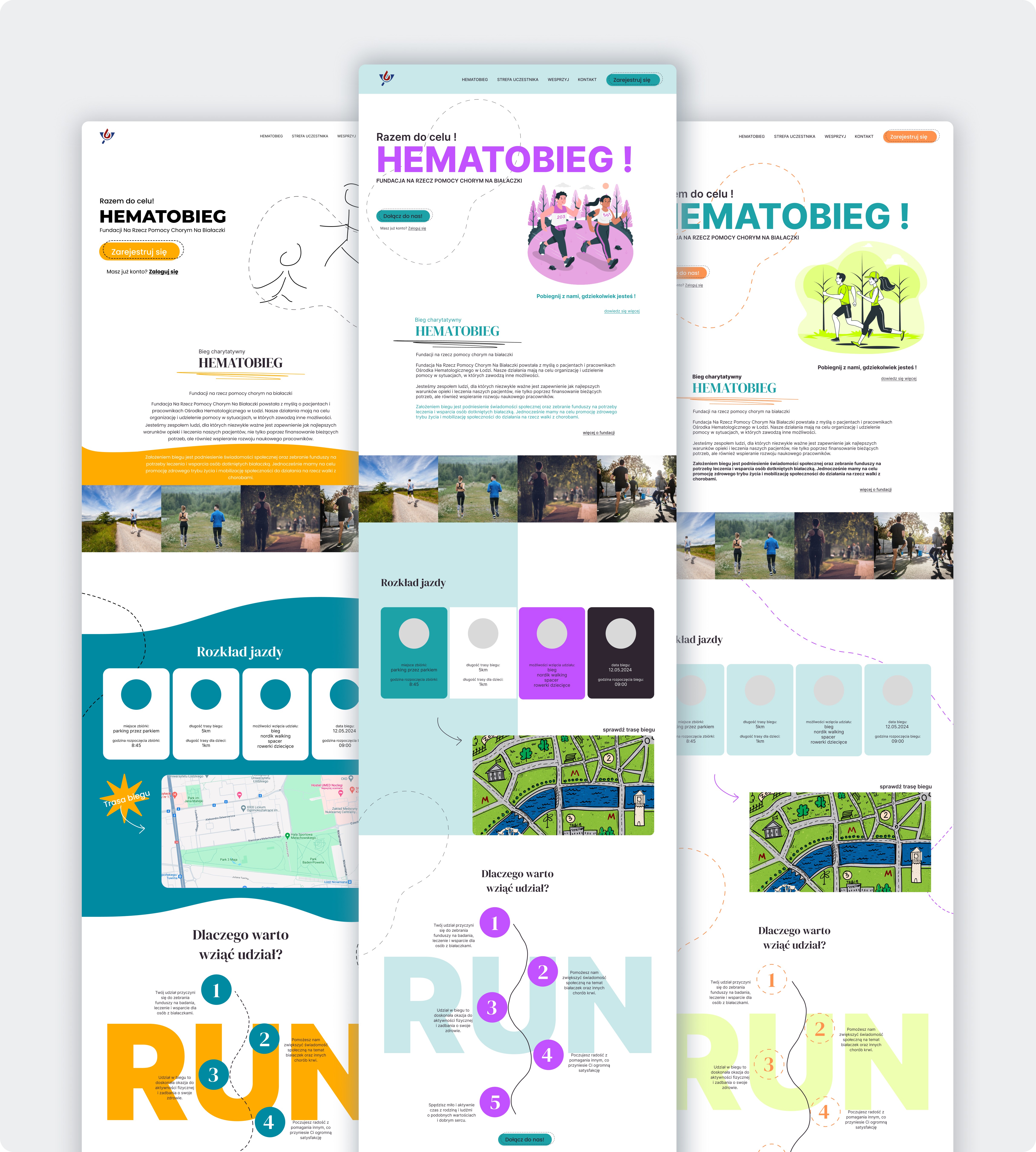
Initial mockups: landing page, patients list, patient's profile
Initial mockups: landing page, patients list, patient's profile
STEP IV
STEP IV
Mobile Version & Responsive Adjustments
Mobile Version & Responsive Adjustments
After completing the desktop layouts, I redesigned all components and sections for mobile screens. The goal was to ensure the website remained fully intuitive and easy to use on smaller devices, where the majority of participants were expected to complete their registration. This included reorganizing content blocks, optimizing tap-targets, and designing collapsible sections to keep the experience clean and effortless.
After completing the desktop layouts, I redesigned all components and sections for mobile screens. The goal was to ensure the website remained fully intuitive and easy to use on smaller devices, where the majority of participants were expected to complete their registration. This included reorganizing content blocks, optimizing tap-targets, and designing collapsible sections to keep the experience clean and effortless.
Key elements:
Reflowing layouts for mobile screens
Optimizing button placement and tap targets
Designing collapsible sections for dense content
Ensuring mobile-first readability
Harmonizing desktop and mobile experiences
Reflowing layouts for mobile screens
Optimizing button placement and tap targets
Designing collapsible sections for dense content
Ensuring mobile-first readability
Harmonizing desktop and mobile experiences
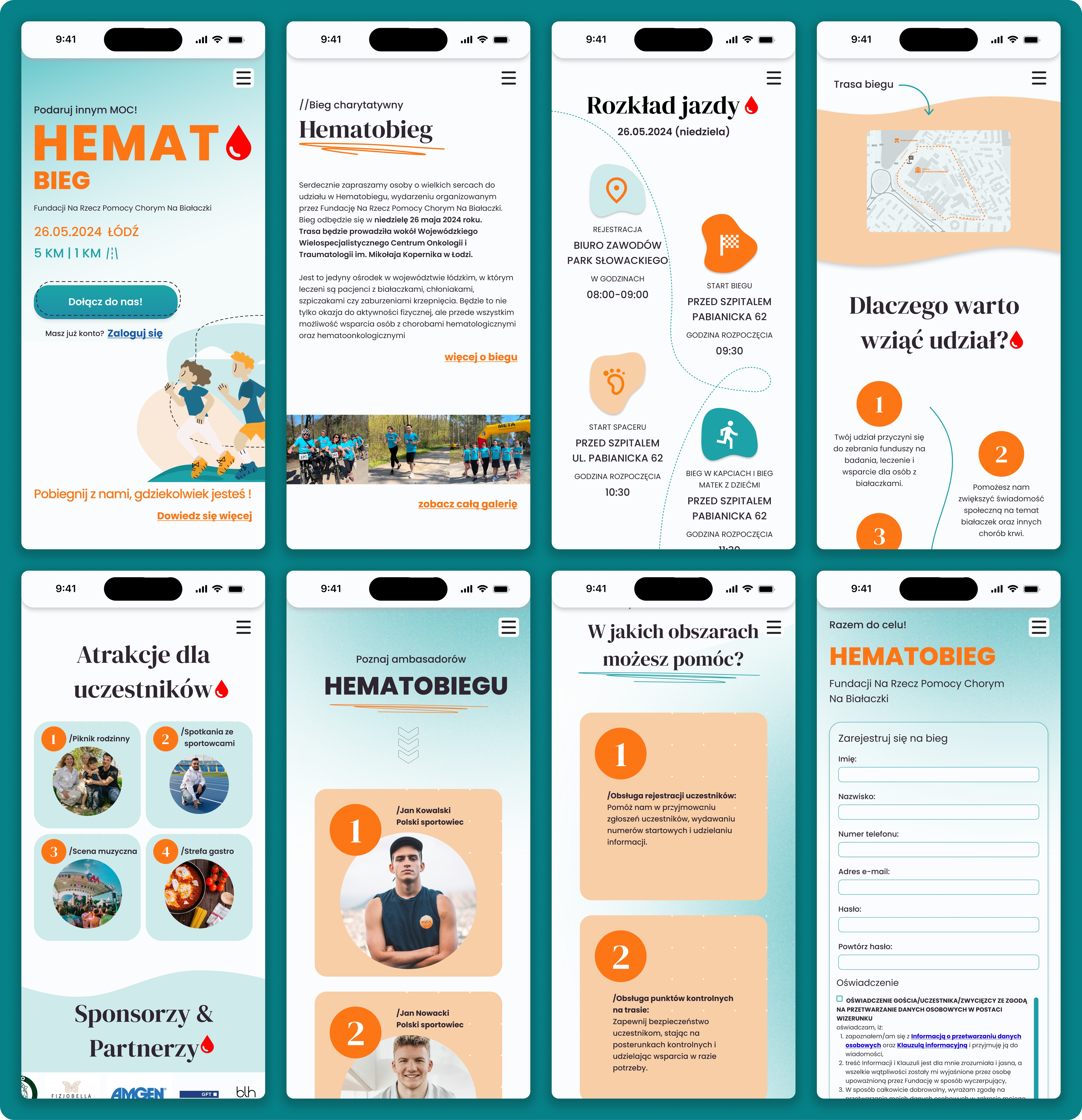
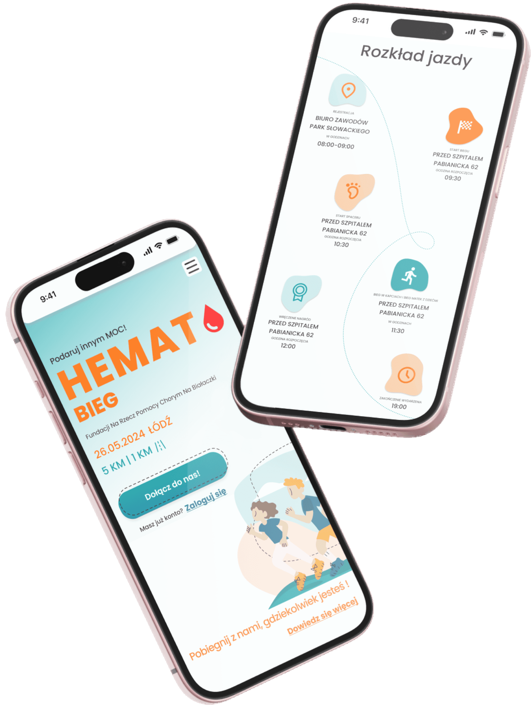
Exemplary mockups of main screens: Home Screen, Patient list and patient profile
Exemplary mockups of main screens: Home Screen, Patient list and patient profile
STEP V
STEP V
Testing, Polishing & Developer Collaboration
Testing, Polishing & Developer Collaboration
In the final stage, I worked closely with the development team to ensure the website behaved exactly as intended. Together we tested form validation, responsiveness, loading behavior, and navigation across devices. Small adjustments were implemented to perfect spacing, registration flow clarity, and overall usability before launch.
In the final stage, I worked closely with the development team to ensure the website behaved exactly as intended. Together we tested form validation, responsiveness, loading behavior, and navigation across devices. Small adjustments were implemented to perfect spacing, registration flow clarity, and overall usability before launch.
Key elements:
Reviewing functional prototypes with developers
Testing form validation and registration flow
Cross-device responsiveness testing
Adjusting interactions and layout precision
Final polishing and deployment support
Reviewing functional prototypes with developers
Testing form validation and registration flow
Cross-device responsiveness testing
Adjusting interactions and layout precision
Final polishing and deployment support